Gmail for Android May Shift Gemini to Revive Account Switcher

Changes to Gemini in Gmail for Android
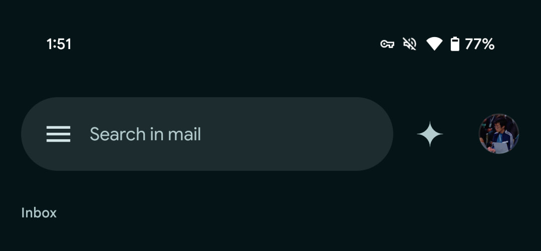
Google is currently testing an update to the way Gemini is displayed in the Gmail app for Android devices. This update aims to return the Google Account switcher to its original position with the user’s profile avatar at the top-right corner of the app, while the Gemini Q&A side panel will be repositioned to the left.
The Original Layout
When the Gemini side panel, also known as “Gmail Q&A,” was first introduced, the Google Account switcher moved alongside the search bar to the left side of the interface. This caused the account switcher to lose its customary place, which is consistent across other first-party applications developed by Google. Users were left to navigate a new layout, which disrupted their muscle memory when switching accounts on their devices.
The Upcoming Changes
With the new update, which appears in version 2025.03.02.x for select Workspace accounts, the profile avatar is getting restored to the top-right corner. The Gemini feature will shift leftward, which reduces the size of the pill-shaped bar used for account switching. Despite the size reduction, Google ensures that the touch targets remain comfortably large for users, allowing for easier interaction when tapping or swiping to switch accounts quickly.
While this change has started appearing for some users, it has not yet been rolled out to the broad user base. This means that many may still see the old layout until the update becomes available to all users.
Updates to the Attachment Menu
In addition to the layout changes, Google is also fine-tuning the attachment menu within the Gmail app for Android and iOS. Now, tapping on the paperclip icon while composing an email will bring up a newly designed menu that lists options including Photos, Camera, Files, and Google Drive.
- The updated attachment menu showcases icons next to each option for easier identification.
- A convenient shortcut to take a new photo has also been added, enhancing the overall user experience.
These changes are designed to streamline the process of adding attachments, making it more user-friendly and visually appealing compared to previous iterations. However, just like the account switcher update, this feature has not been widely released yet, so many users may not see these changes immediately.
Visual Comparisons
To get a clearer idea of what’s changing, here are comparisons between the old and new layouts. In one representation, the old layout places the account switcher among other components on the left, while the new design restores its position to the top-right corner.

With these updates, Google aims to enhance the Gmail experience on mobile devices, making it more intuitive and aligned with user expectations. Users will have to stay tuned for the full rollout of these changes as they become available in the coming weeks.


