Unveiling Visualize with Copilot (Preview)
Unveiling Visualize with Copilot
Making informed business decisions hinges on understanding data insights. However, manually sifting through extensive data sets, creating charts, and fiddling with filters can lead to fatigue and frustration. To streamline this process, Microsoft is launching a game-changing tool called Visualize with Copilot. This feature allows users to convert complex data into clear, interactive charts instantly, whether you’re monitoring sales figures, enhancing customer service, or managing inventory.
What is Visualize with Copilot?
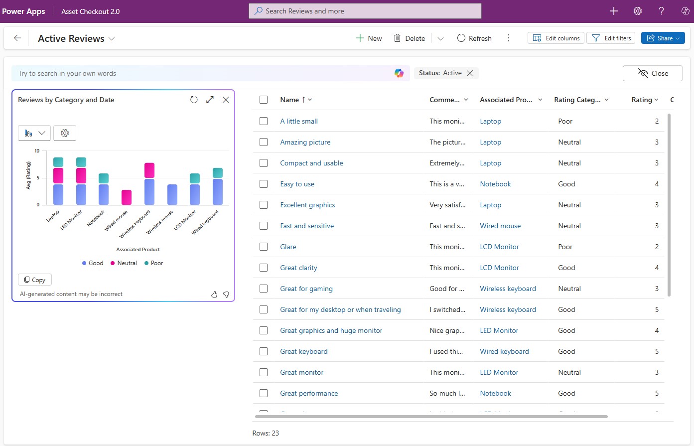
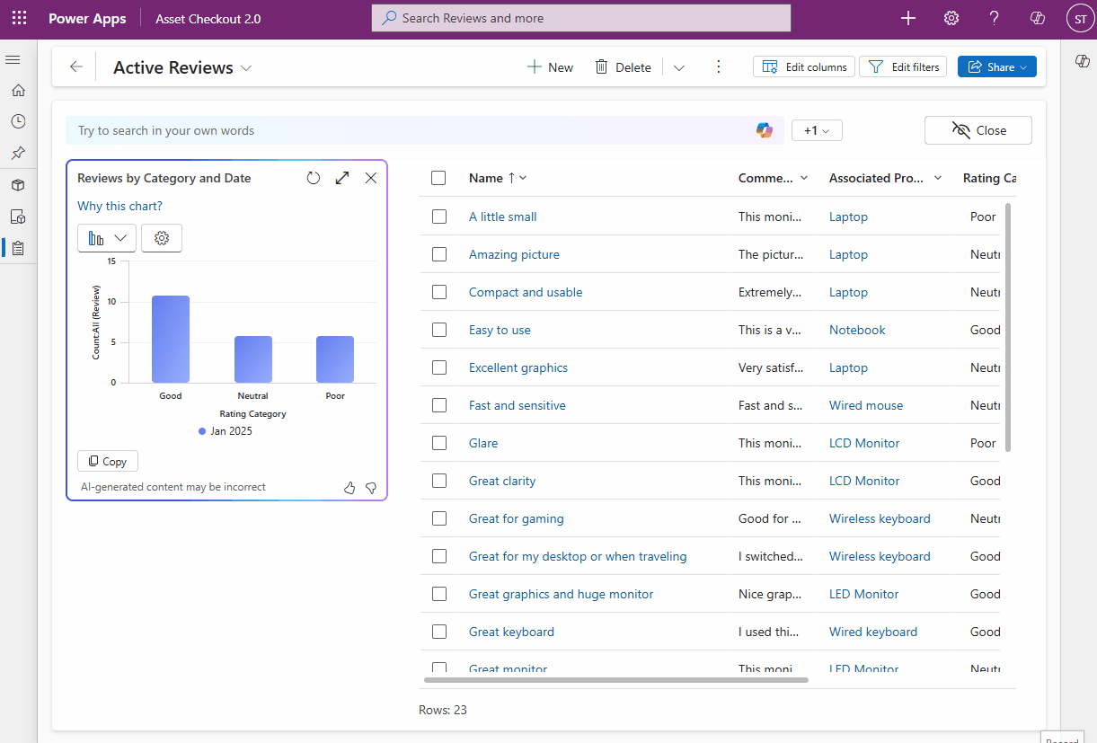
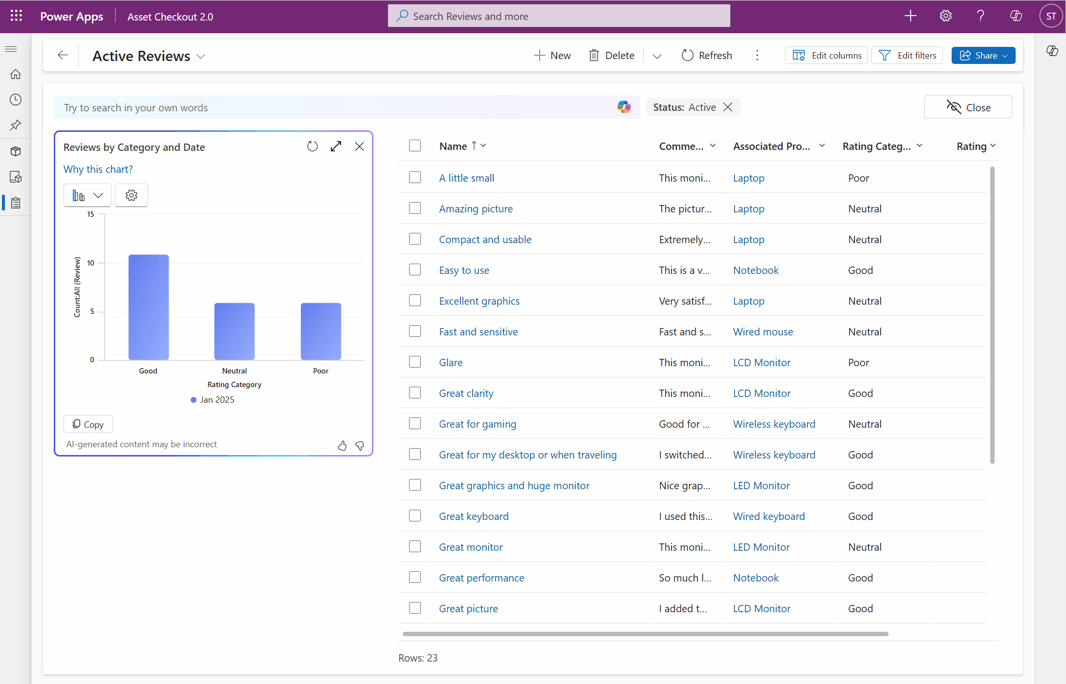
Navigating data typically involves exporting data into spreadsheets, generating reports, and adjusting filters. With the Visualize with Copilot feature available in Power Apps, data exploration becomes straightforward. With just one click, you can convert your data into a visual format, revealing trends, patterns, and relationships easily. Each generated visualization provides an AI-generated title and context, ensuring that users fully understand the insights presented.
Customizing Your Visuals with Ease
One of the standout features of Visualize with Copilot is its capacity for customization. The data exploration agent is designed to support user preferences seamlessly. You can effortlessly change the chart type, modify columns, or adjust data aggregation. This flexibility allows you to tailor visualizations to better suit the specific needs of your analysis.
Dynamic Interaction with Data Visuals
Interactive visuals enhance the data exploration experience significantly. With Visualize with Copilot, your charts are dynamically linked to the underlying data grid. This means you can engage with your visualizations — selecting specific chart sections will filter the data grid, helping you refine your focus and analyze in real-time. Additionally, natural language filtering lets you type your queries directly, allowing the system to adjust your data grid and chart promptly, transforming raw data into actionable insights.
How to Activate Visualize with Copilot
To get started with Visualize with Copilot in your model-driven applications, you need to update a couple of settings in the Power Platform Admin Center. Here’s how:
- Go to Natural language grid and view search and set Enable this feature to All users immediately.
- Toggle Allow AI to generate charts to visualize the data in a view to On.

Getting Started
For more comprehensive guidance on using Visualize with Copilot, you can visit the official documentation page. This powerful feature is rolling out with build 9.2.25013 and is expected to reach users across various regions by the end of the month. Your feedback would be invaluable during this transition; feel free to share your experiences in the community forum dedicated to this topic.